BoxLang 🚀 A New JVM Dynamic Language Learn More...
Studio Starter
A ContentBox 7 theme with ready-made blocks for ContentBox Studio, built with Tailwind CSS from HyperUI's marketing components. One set of blocks, several looks: a design preset switches colors, fonts and corners for the whole site.
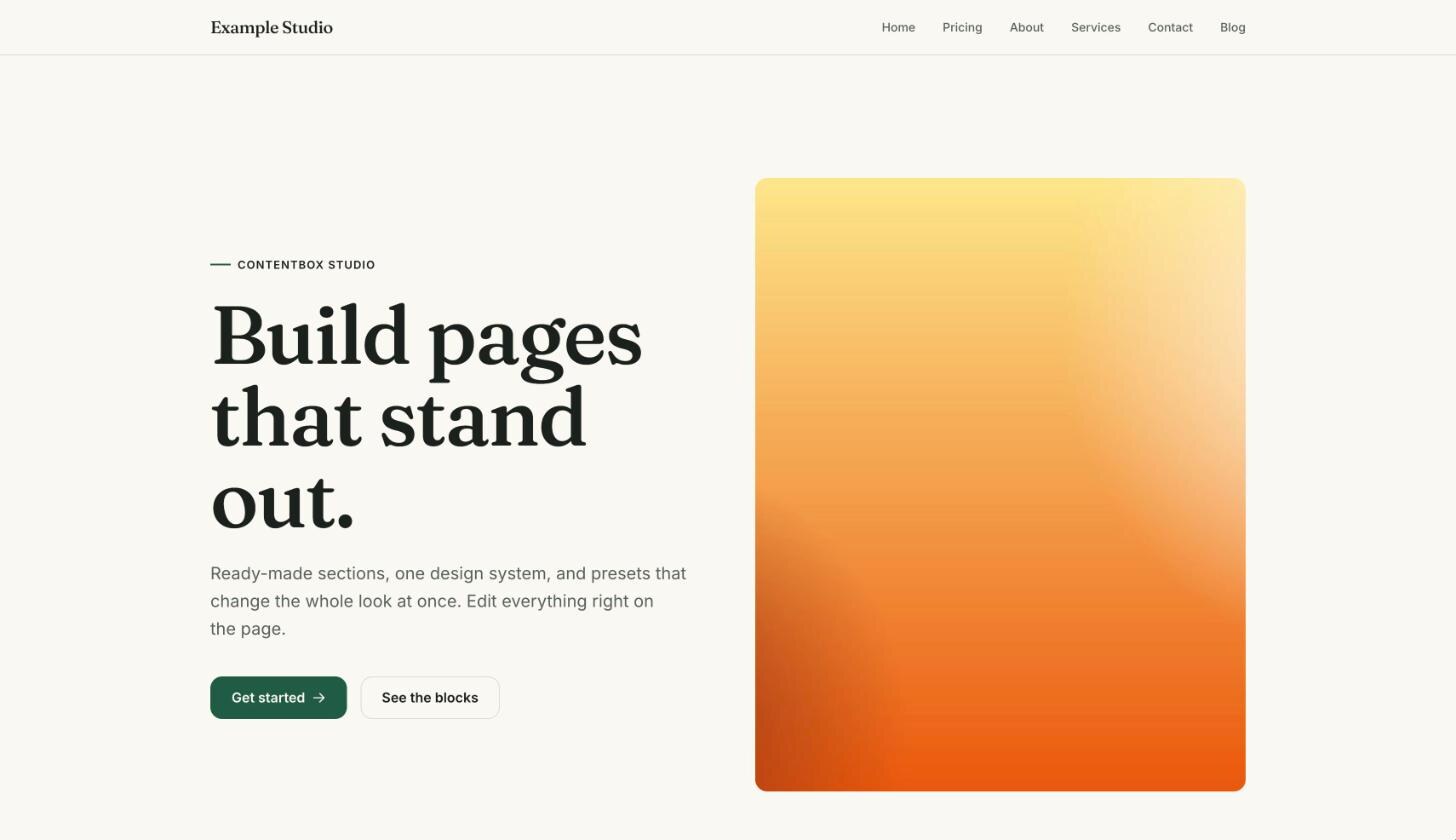
Status: 0.1.0, the first version (five section blocks, two presets, blog), on ForgeBox.
| Documentation | |
|---|---|
| Blocks | Every block with a screenshot and its fields |
| Customizing | Presets (and making your own), tones, header and footer, theme settings, your own blocks |
Requirements
- ContentBox 7.
- ContentBox Studio to edit pages with the blocks. Without Studio the theme still works as a ContentBox theme: content written in the classic editor appears in a reading column.
- No Node.js on the server: the built CSS and the fonts are part of the theme.
Installation
In the root of the ContentBox site:
box install studio-starter
It goes to
modules_app/contentbox-custom/_themes/studio-starter.
Without CommandBox, clone or unpack it there:
git clone https://github.com/akitogo/studio-starter.git modules_app/contentbox-custom/_themes/studio-starter
Keep the folder name studio-starter: ContentBox stores
the theme settings under it. Then, in ContentBox's admin:
- Look & Feel → Themes, Rebuild Registry, and activate Studio Starter for the site.
- Choose a Design preset in its settings (see Customizing).
- If the site already has content made with Studio's Text and Heading blocks, re-render it once, so it uses the theme's versions of them (see Build).
What is in it
| Part | |
|---|---|
Section blocks
(blocks/) | Hero (heading, intro, two buttons, optional image), Content with image (rich text, button, image side by side in three widths or below the text), Features (grid with icon, title, text), Pricing (up to four plans with price, features, button; one highlighted), Call to action (heading, text, button, optional image) |
| Core blocks | Text and Heading replace Studio's core blocks of the same name (same fields, so existing content keeps working) with the theme's typography in a reading column |
| Tones | Every section block has a background: light, light tinted, dark or brand color. Everything inside (text, lines, buttons) follows |
| Presets | Bold (grotesque headings, signal orange, square corners) and Editorial (serif headings, deep green, rounded corners); theme setting Design preset. A preset has its own brand color for dark sections, so accents stay visible there |
| Blog | List as cards (featured image or a brand-colored panel with the category, date, categories, excerpt or meta description), category and search views, ContentBox's paging in the theme's look; post view with categories, featured image and the post's blocks or text |
| Layout | Header with site name, main menu (ContentBox menu, plus Blog when the blog is on) and optional button; dark footer with the same links |
| Classic content | Pages without blocks get a title and a reading column with Tailwind Typography |
| Studio's editor | blocks/_canvas/entry.cfm:
the header of a blog entry above its blocks while editing (same
as on the post page); blocks/editor.css: the page
background, font and text color in the editor canvas |
Not yet: comments on posts (ContentBox's comment form comes with Bootstrap markup), a blog teaser block (blocks render when saved, so a list of the latest posts needs a ContentBox widget instead).
In Studio's editor
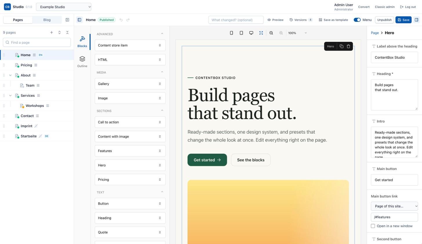
The editor's canvas loads the theme's stylesheets, so blocks look as
they do on the site. blocks/editor.css gives the canvas
the page background, font and text color of the layout, and
blocks/_canvas/entry.cfm shows a blog post's header above
its blocks while editing.
How the styling works
-
src/theme.cssis the Tailwind entry. Templates use only semantic colors (bg-surface,text-ink,text-muted,border-line,bg-brand,text-brand-ink),rounded-box, and a few utilities of the theme (heading,eyebrow,btn,btn-primary,btn-secondary). - A preset (
src/presets/<name>.css) defines raw values only (--ss-paper,--ss-ink,--ss-brand, fonts, radius, heading weight). The tone classes map them to the semantic colors, so a section can be light, dark or brand colored without other classes. - The layout links the preset's stylesheet before the theme's. Both
are
<link>s, so Studio's editor canvas loads them too and shows blocks exactly as the site does. - Fonts are self-hosted (no requests to font services), with their licenses next to them.
Build
Sites need no Node: the built CSS and fonts are part of the theme. After changing templates or styles:
npm ci
npm run build    # presets with fonts, then Tailwind (scans blocks/, layouts/, views/)
The layout adds each stylesheet's modification time to its address
(theme.css?v=…), so browsers load the new CSS at once.
Then re-render the content in Studio (POST
/cbstudio/api/blocks/rerender, or save the pages), because
block HTML is rendered when content is saved.
Class names must appear complete in the templates for Tailwind to
find them: map values to full names ({ "2":
"md:grid-cols-2", "3":
"md:grid-cols-3" }), do not build them (md:grid-cols-#n#).
ContentBox quirks the theme works around
- No theme setting is marked
required: ContentBox 7 checks required theme settings under their plain names while the admin posts them ascb_theme_<theme>_<name>, so the settings form could never be saved. - ContentBox caches whole pages and does not clear them when theme
settings are saved;
Theme.cfclistens tocbadmin_postThemeSettingsSaveand clears the page caches, so a new preset shows at once.
License
Apache License 2.0, by Akitogo Internet and Media Applications GmbH. Third-party material (HyperUI, Heroicons, Tailwind CSS, fonts): see THIRD-PARTY.md.
Changelog
All notable changes to Studio Starter. The format follows Keep a Changelog, versions follow Semantic Versioning.
[0.1.0] - 2026-11-21
First version.
Added
- Section blocks for ContentBox Studio: Hero, Content with image (four layouts), Features, Pricing, Call to action; the theme's own Text and Heading in place of Studio's core blocks.
- Background tones per section (light, light tinted, dark, brand color).
- Design presets Bold and Editorial (theme setting), with self-hosted fonts.
- Layout with header (main menu, blog link, optional button), footer and mobile menu.
- Blog list as cards, category and search results, post view; the post header in Studio's editor.
- Theme settings: preset, language, blog heading, header button.
- Page caches are cleared when the theme settings are saved.
-
Akitogo Team
- Published
-
0.1.0 is the latest of 1 release(s)
Published
- Published on {{ getFullDate("2026-11-21T07:35:40-06:00") }}
-
-
 Apache2
- akitogo/studio-starter

Use It
								$
									box install studio-starter
Collaborators 0
Stats
- {{ getFullDate("2026-11-21T07:29:58-06:00") }}
- {{ getFullDate("2026-11-21T07:35:40-06:00") }}
- 35
- 1